Energy Sankey
An interactive model of how America's energy system could change by 2050, based on what energy actually costs.
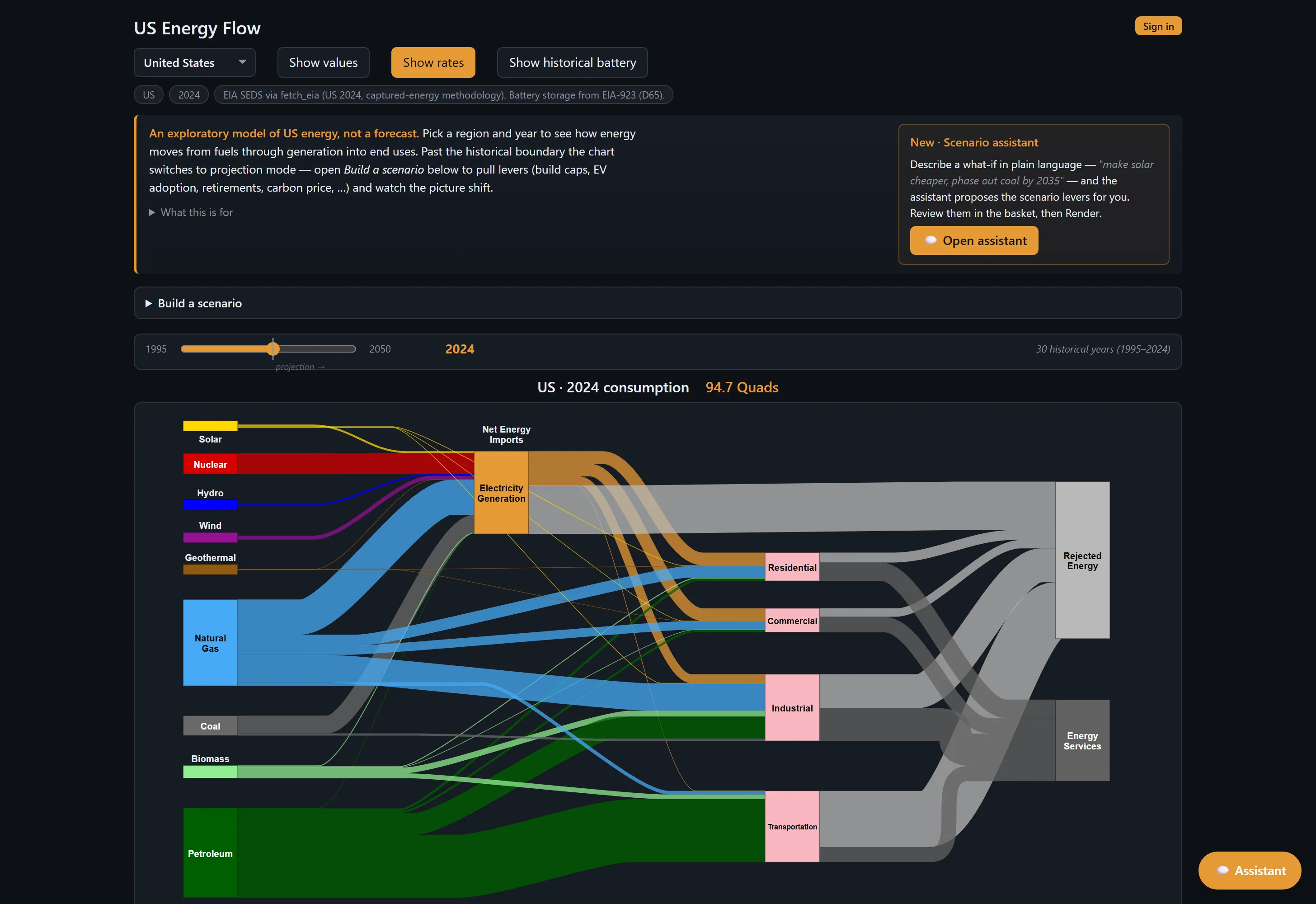
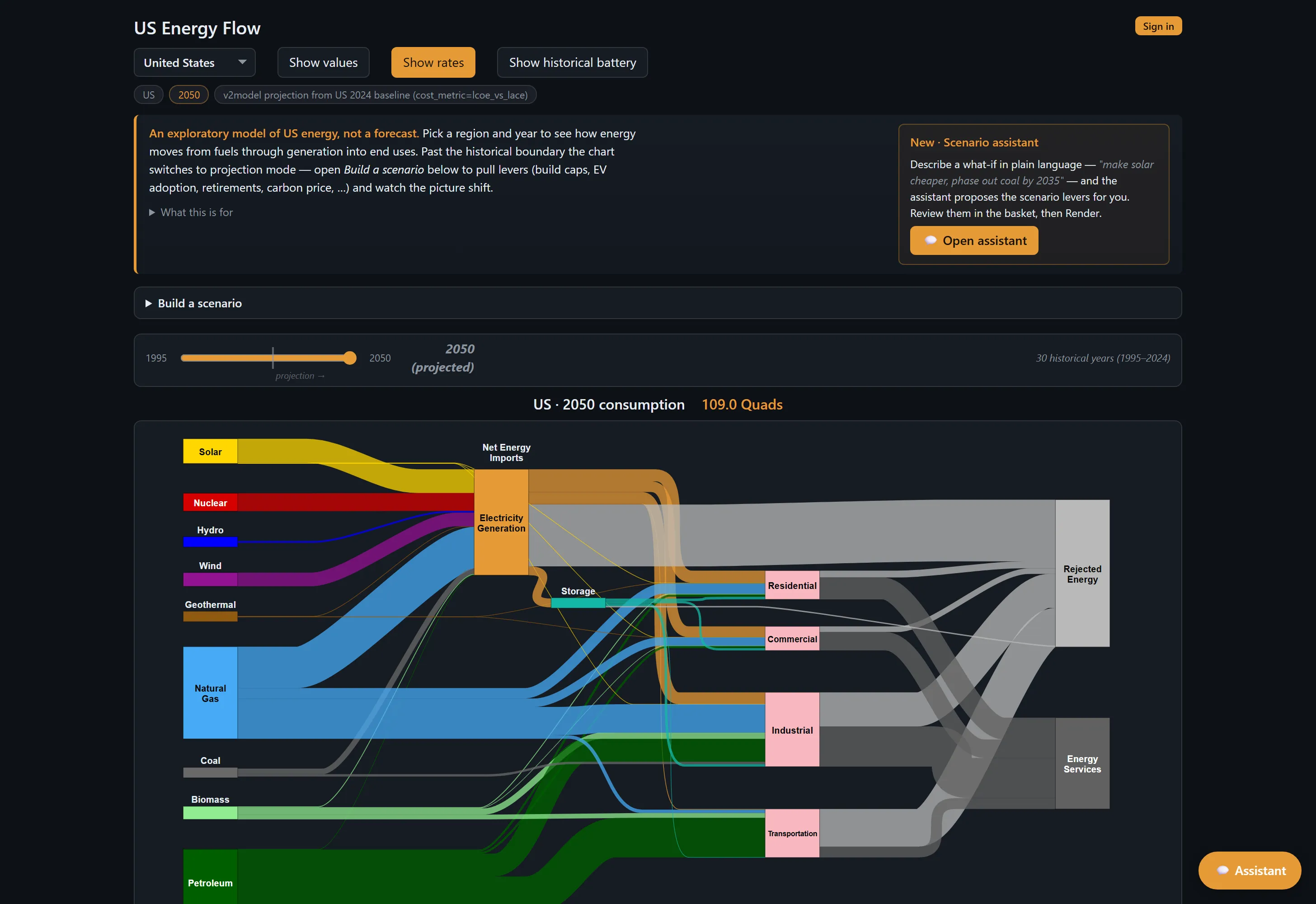
The Energy Sankey is an interactive model of how energy moves through the U.S. economy, from raw fuels through power generation to the homes, businesses, and vehicles that use it. It builds on the well-known energy flow charts from Lawrence Livermore National Laboratory, which pack the nation’s entire energy picture into a single graphic. This project adds a forecasting engine on top, so you can scrub through three decades of history (1995–2024), run a forecast out to 2050, and build your own “what if” scenarios, by hand or just by asking in plain English.
The project started as a consulting engagement with NosTerra Ventures. It was built to test one idea: that the move to clean energy will be driven by economics rather than mandates, because clean energy that is cheap and plentiful is better for everyone. It’s made for the people who shape that move: policymakers, investors, and climate-tech builders.
What it does
- Shows the full energy picture in one chart, from fuels to end use, for both the past (1995–2024) and a forecast to 2050.
- Forecasts by following the money. Each year the model builds more of whatever has become the cheapest option, so you can see where the economics naturally lead.
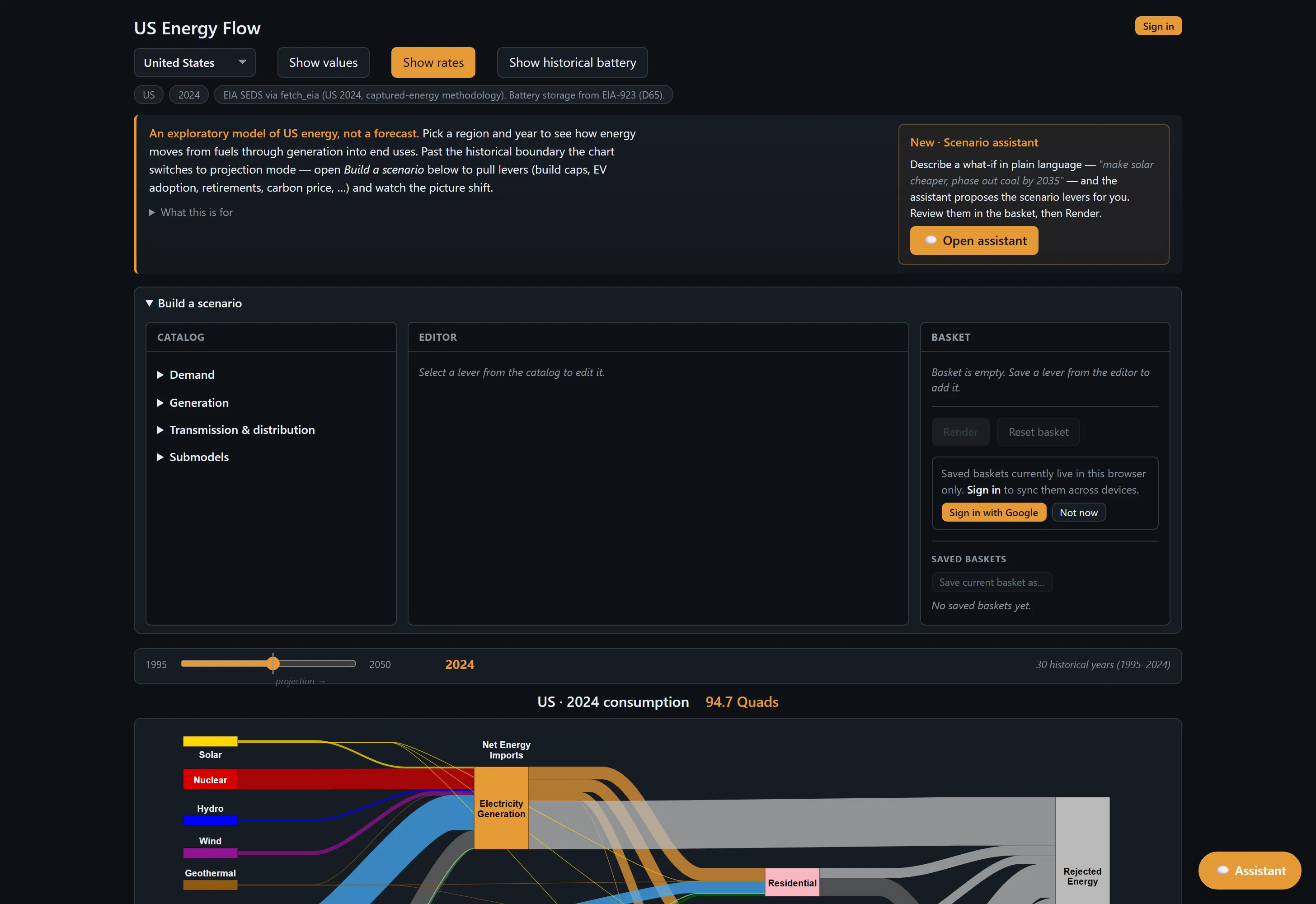
- Lets you build your own scenario. Adjust how fast electric vehicles catch on, when old power plants retire, the price of carbon, or government policy, then watch the picture change.
- Includes an AI assistant that makes a complicated model approachable. The model has an overwhelming number of settings; the assistant lets you describe what you want in plain English instead of digging through all of them. It suggests changes for you to review rather than quietly editing the chart. It’s not a chatbot bolted onto a web page.
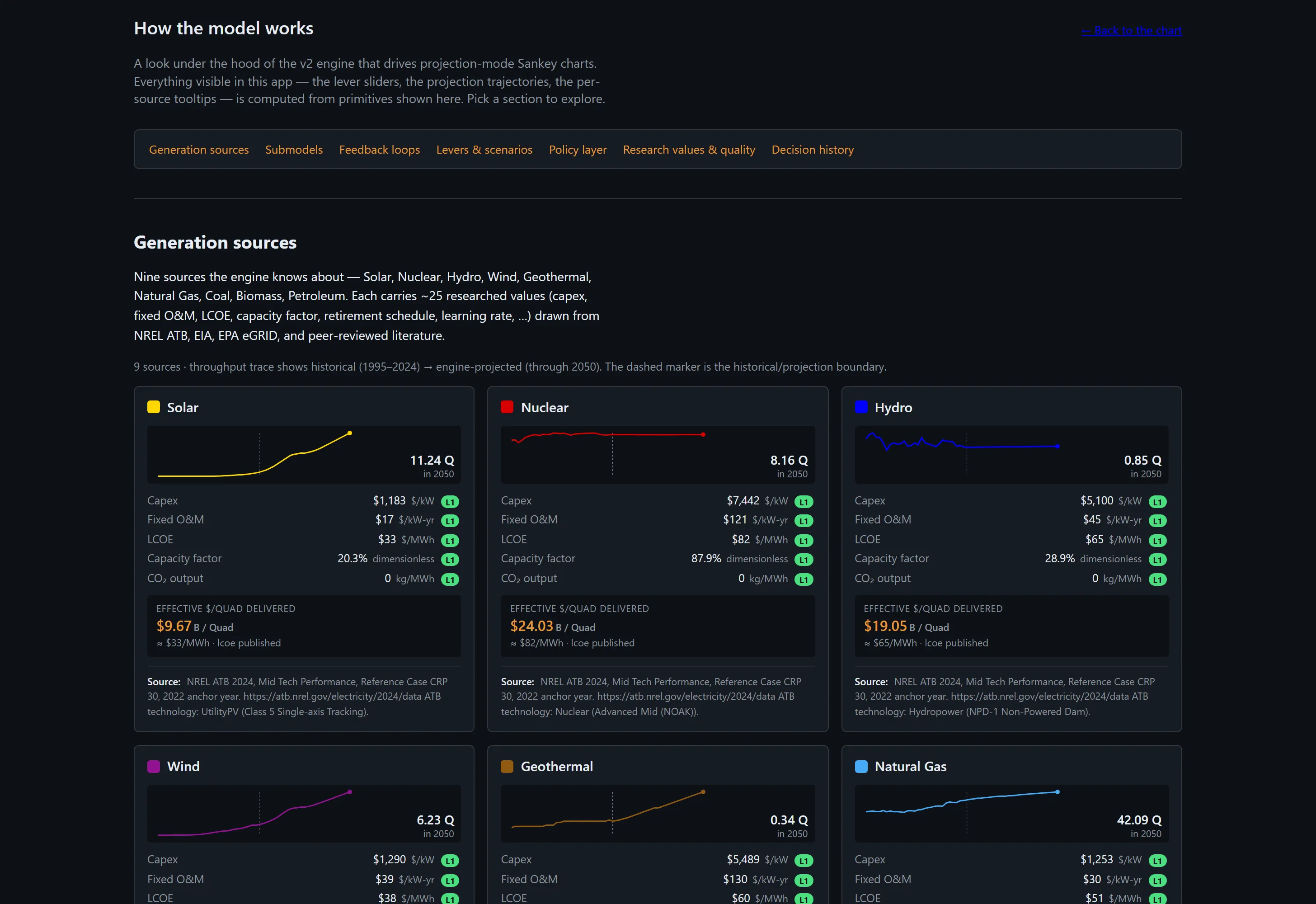
- Backs every input with a real source you can check, not a guess.
- Saves your scenarios when you sign in, so you can pick them back up on any device.
How it turned out
This 2026 edition is a complete solo rebuild. I now own the whole thing, from the forecasting engine to the chart itself to the AI assistant. Every number that feeds the model is tracked with its source, how reliable it is, and when it was last checked, so the model can be verified instead of taken on faith. When I test its forecasts against real history, they come within about 18% of what actually happened up to six years out. And when the energy system is under strain, the model says so plainly rather than quietly hiding it.
The goal was to take a dense, carefully reasoned argument and make it easy to see. You can watch clean energy get cheaper as its manufacturing matures, and see how those falling prices push even more of it to get built. You can weigh the trade-offs for yourself. It’s live and ready to share today, and I’m still refining it as I get it in front of the people it’s meant for.
GALLERY
BUILT WITH
- Python
- FastAPI
- D3.js
- Vite
- Node.js
- Vercel
- Neon Postgres
- Claude